
New Jersey Shares
ABOUT PROJECT
New Jersey Shares is one of the accounts that I worked on while at Mosaic Strategies Group. Below I showcase a few highlights from my time on this account. My main responsibility was to ideate concepts and designs for their monthly social graphics in an effort to further develop the brand’s style on social. In addition, I worked on the collateral in preparation for New Jersey Shares’ 25th Anniversary.
NEW JERSEY SHARES' 25TH ANNIVERSARY
The first section of this page focuses on the collateral I created to prepare for the big fundraising push New Jersey Shares was doing for its 25th year.

SOCIAL GRID The idea was to make it the “splash” image alerting people of the 25th anniversary. My intentions here were to highlight that but to incorporate a storytelling aspect as well that may identify “branding” aspects used in future anniversary graphics. I wanted to feel movement by having shapes scattered around. Some shapes were solid colors and others were images of people representing those whom the brand is centered around.
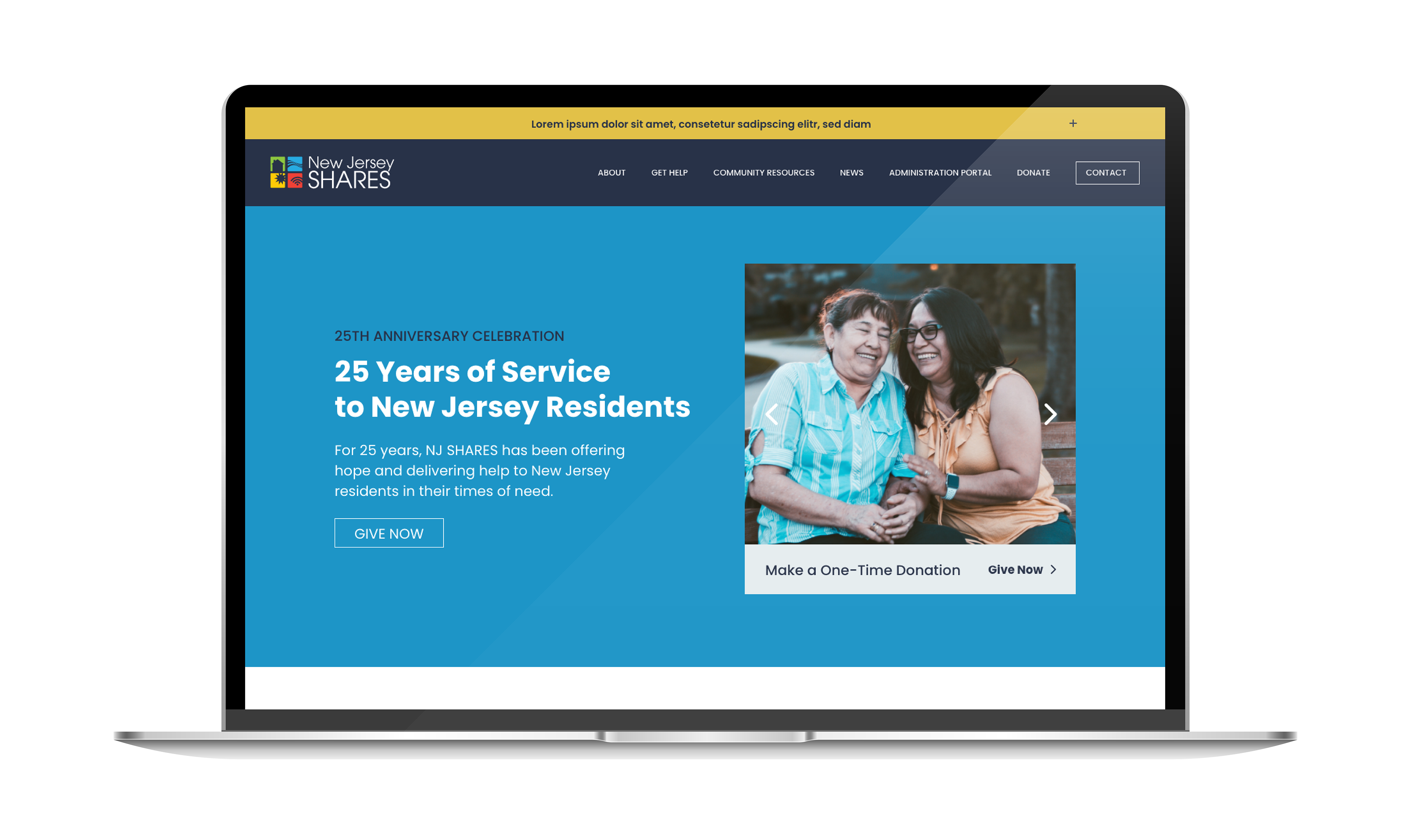

LANDING PAGE What is the point of this page? This is the question I asked my project manager when I read through the copy for the page. While the focus was all the ways someone could give for the anniversary, I felt there was an indicator missing at the top to alert people that hey, this page is about the 25th anniversary. I tried to put myself in the place of the viewer. If I was clicking on the page, I’d want few but clearly identifiable words to introduce the 25th anniversary before continuing down the journey. Once we worked through this part, the rest of how we laid out the page became easier.

WAYS TO GIVE - SOCIAL GRAPHICS These graphics represented the ways someone could give during the 25th anniversary - as outlined on the webpage. The challenge here was the amount of copy and content the project manager was trying to include in each. In order to keep them organized, I set out to have a clear hierarchy and consistent layouts throughout each page.
MONTHLY SOCIAL GRAPHICS - PUSHING THE BRAND FORWARD
The first account I touched when I was brought on as a contracted designer was New Jersey Shares. I was to create templates for the monthly calendar of social graphics. The difficulty I faced was that there was an inconsistency in style and color usage. Almost every graphic on the page was a solid colored background: yellow, blue, orange. These were extremely powerful colors that one would generally see in alert signs, especially yellow and orange. The result was that the colors were jumping out at me more than the words and concepts and it was hard to read the graphics. I felt like I was suffocating looking at it because white was missing. White provided space, and air to breathe and it was missing. I looked to see how we could identify some colors as backgrounds while others as accents.


CLIENT New Jersey Shares
MY ROLE Ideation and Design of monthly social media graphics; Brand Development of social media; Design of digital deliverables: website design for anniversary landing page
AGENCY Mosaic Strategies Group