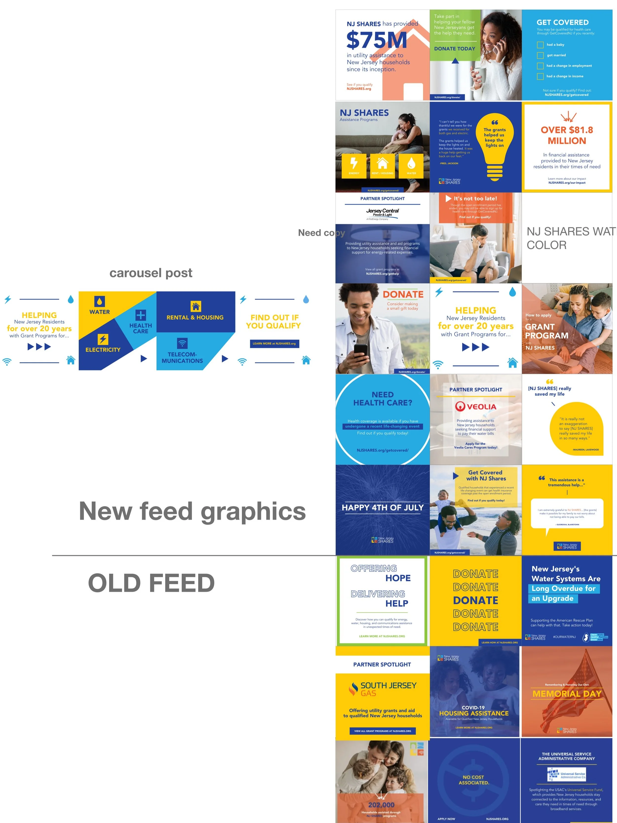
Social Media
As part of my process, I utilize XD boards as “layout” boards for social graphics. This enables me to identify “like” systems and continue these patterns throughout the feed, creating more consistency. Therefore, the visuals you see on this page may be screenshots from my XD boards.
Client: New Jersey Shares
(Agency - Mosaic Strategies)
The two things the team had me focus on was color and imagery usage.
Read more below.
-
The brand has a lot of colors (5, without white). The team wanted to find a better use for the colors across the feed. Myself along with the sr. designer believed that the consistent use of strong colors like yellow, orange, and dark blue made the feed over-saturated.
-
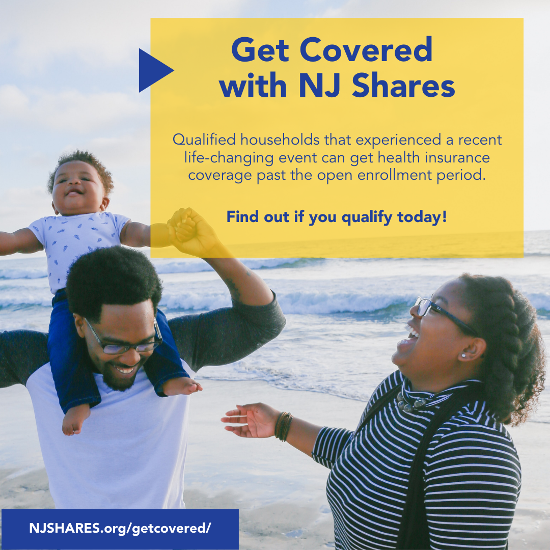
The point of the graphics was getting lost as a result of the heavy color overlays. This caused the imagery itself to lose attention. My goal was to create graphics that used imagery well by distinguishing background photos from photos that should be focal points and drove the message. One example of a graphic that uses the image to tell the story is to the “get covered graphic” displayed here.


Client: AAPD Foundation (American Academy of Pediatric Dentistry)
(Agency - Mosaic Strategies)
I utilized my XD board to identify strong elements that were used in previous graphics in order to develop the new ones. In this case, the colored circle was an element that stood out to the Sr. Designer and me and set the brand apart.
Read more below
-
The sr. designer expressed to me when I was brought on her desire to find consistency in the feed by using shapes and color in a strategic way. One shape that stood out to me and made this brand feel “unique” was the blue circle behind a cut-out of a child (as shown in the water graphic in the image). Other patterns were color gradients as well as main words/headlines being bold and in color while copy being in a dark gray.


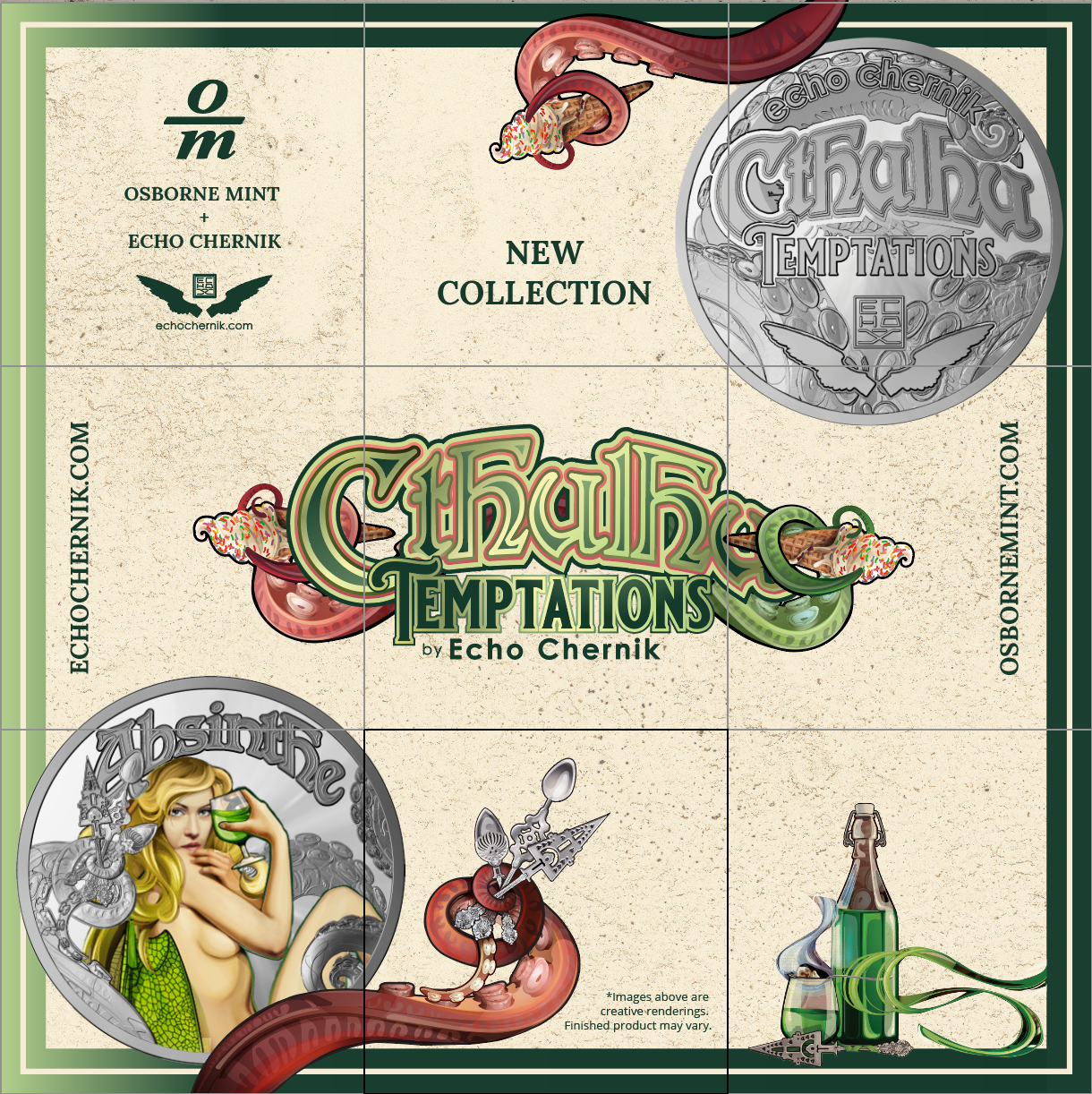
Client: Osborne Mint
Deliverable: Grid Poster
(Agency - Mosaic Strategies)
What I wanted to showcase here were the grid designs I made for Osborne Mint as part of their social calendar. The one design, in particular, was part of a collection they debut and as a result, did a lot of promotion around. I created multiple pieces of collateral for it, including a postcard that can be viewed here. The image next to the grid is the artist’s artwork that the client provided me and I used it as inspiration for the grid.
Read more below
-
The challenge of a grid design for me is finding a way to make each post stand on its own but yet also read as a whole. For this design I researched grids online. I noticed a pattern within the layout. The title was in a prominent spot and then each individual post had an aspect of the concept, almost like in every corner. That was the framework to this design.