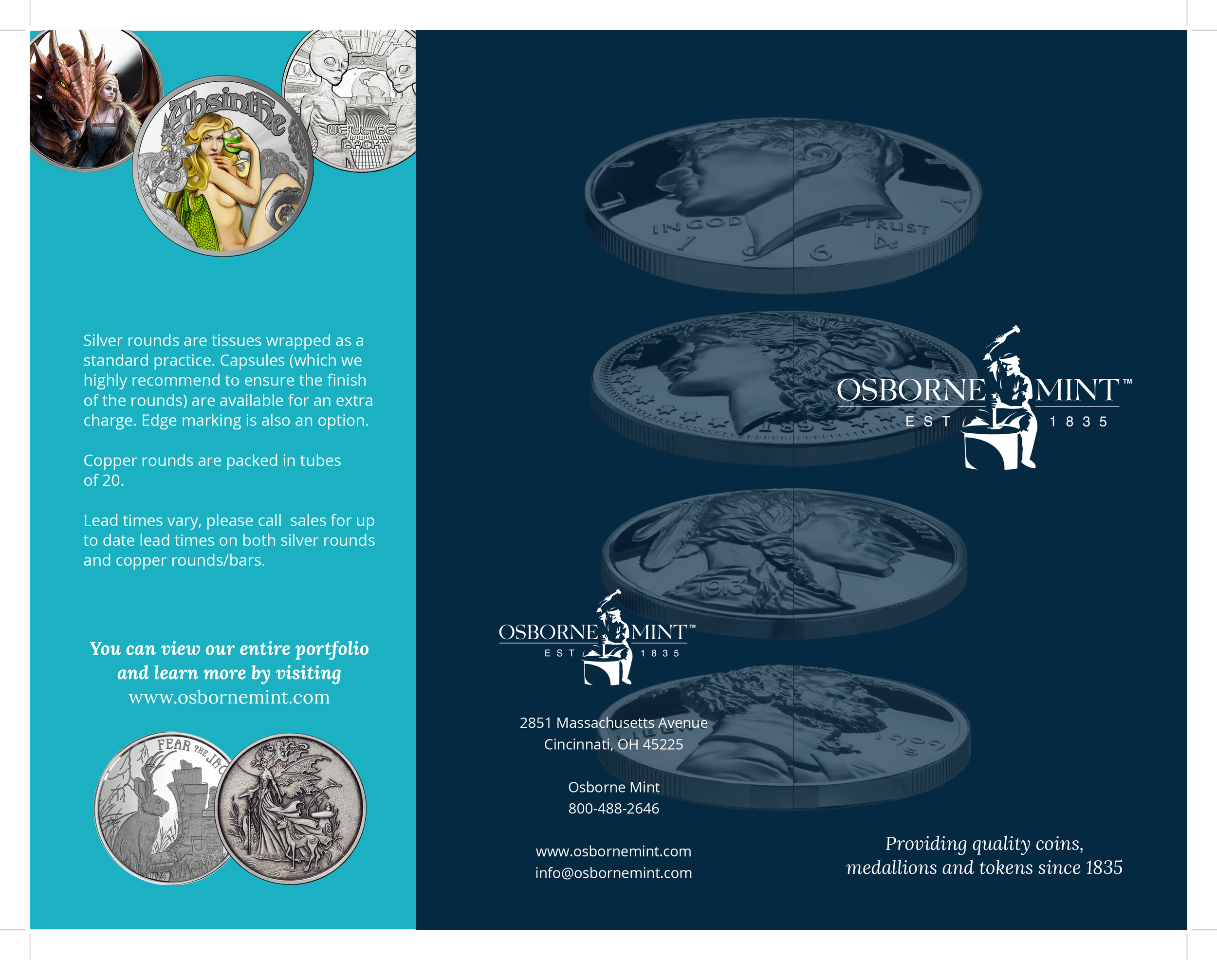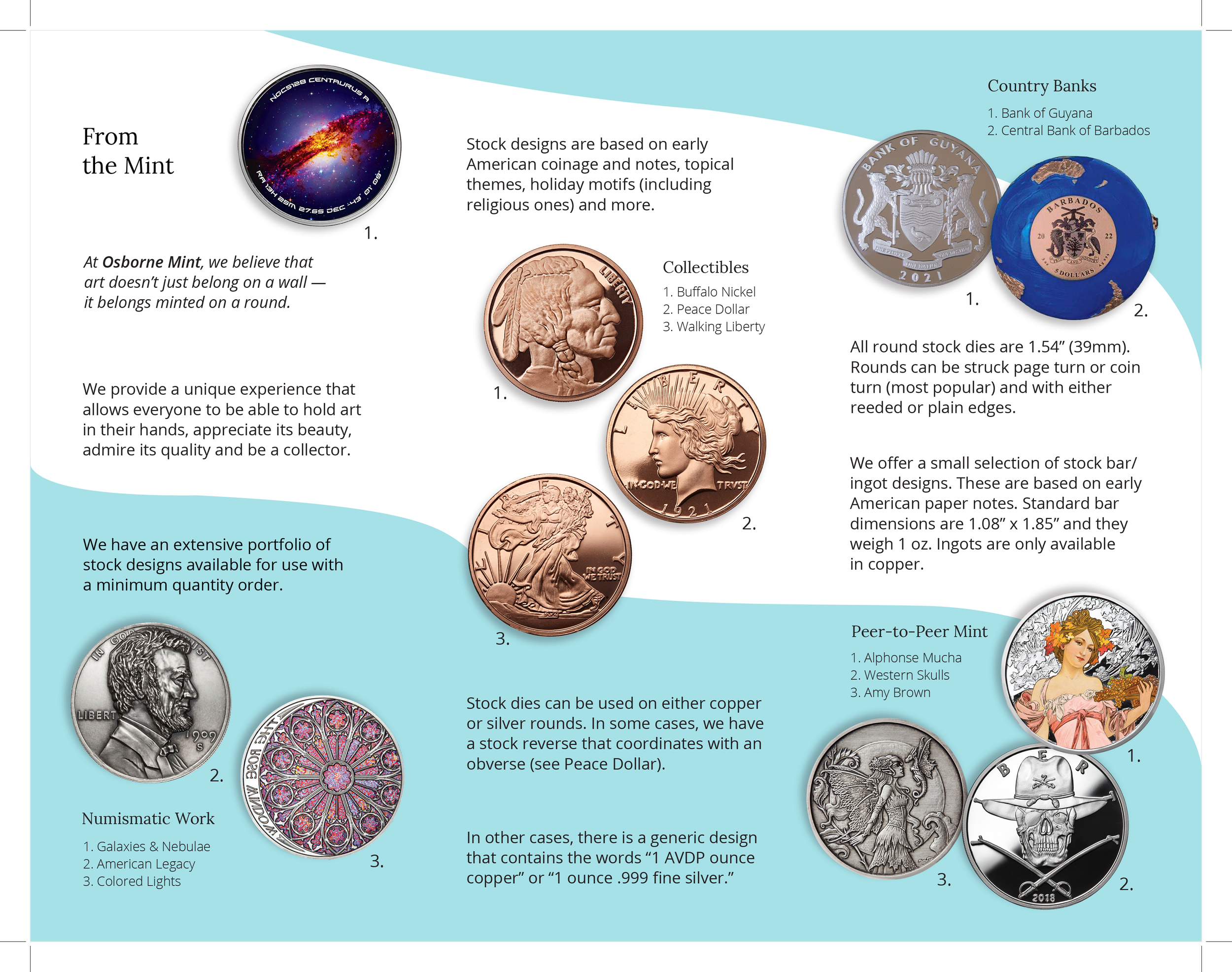
Early version-1 - front

Early version-1 - back


Early version-2 - front

Early version-2- back


Final version-front close-up


Final mockup- back

my role Contract Designer at Mosaic Strategies; Designer
more info This trifold brochure was created for a client of an agency I worked with. This brochure would showcase one sector of the client’s company, a coin-minting company.
Some questions I asked myself before approaching this were: How do I lay out the content?; How can I utilize color and shapes to guide the viewer through the brochure?
The largest question was: how do I start? Well, you read from left to right, so I wanted a large text indicator at the top left.
Each of the design collections were to be scattered throughout and that’s when I thought about using curved shapes to help guide the viewer through the different groupings. Without a shape or something guiding the viewer, I thought it was difficult to know what order the groupings were displayed in. These shapes were influenced by a larger brochure the Sr. designer created that I used as reference. I added a shape on the front size to alert the viewer to open it.
