

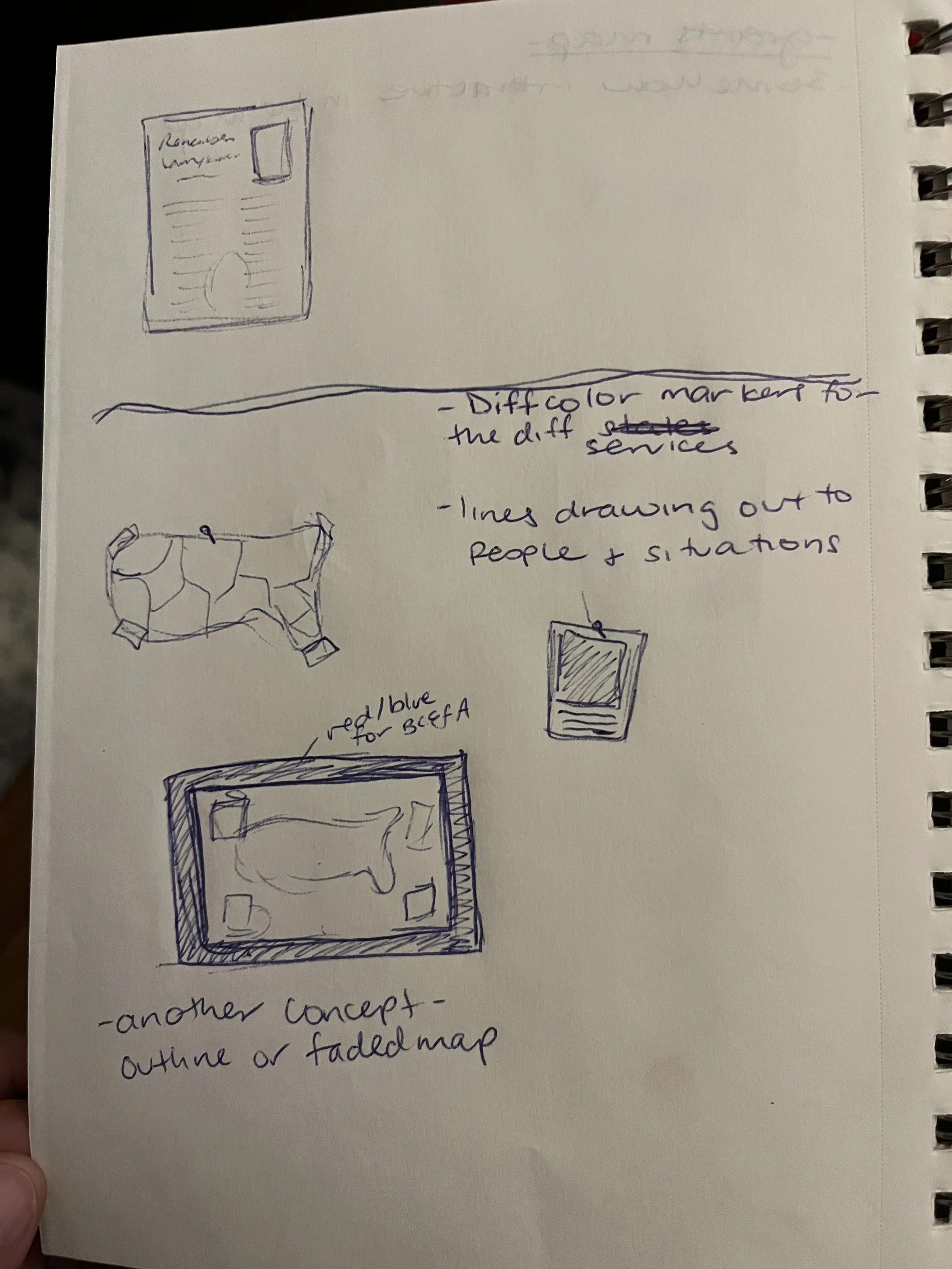
early sketches for map


fleshing the idea out a bit more
early sketches for map
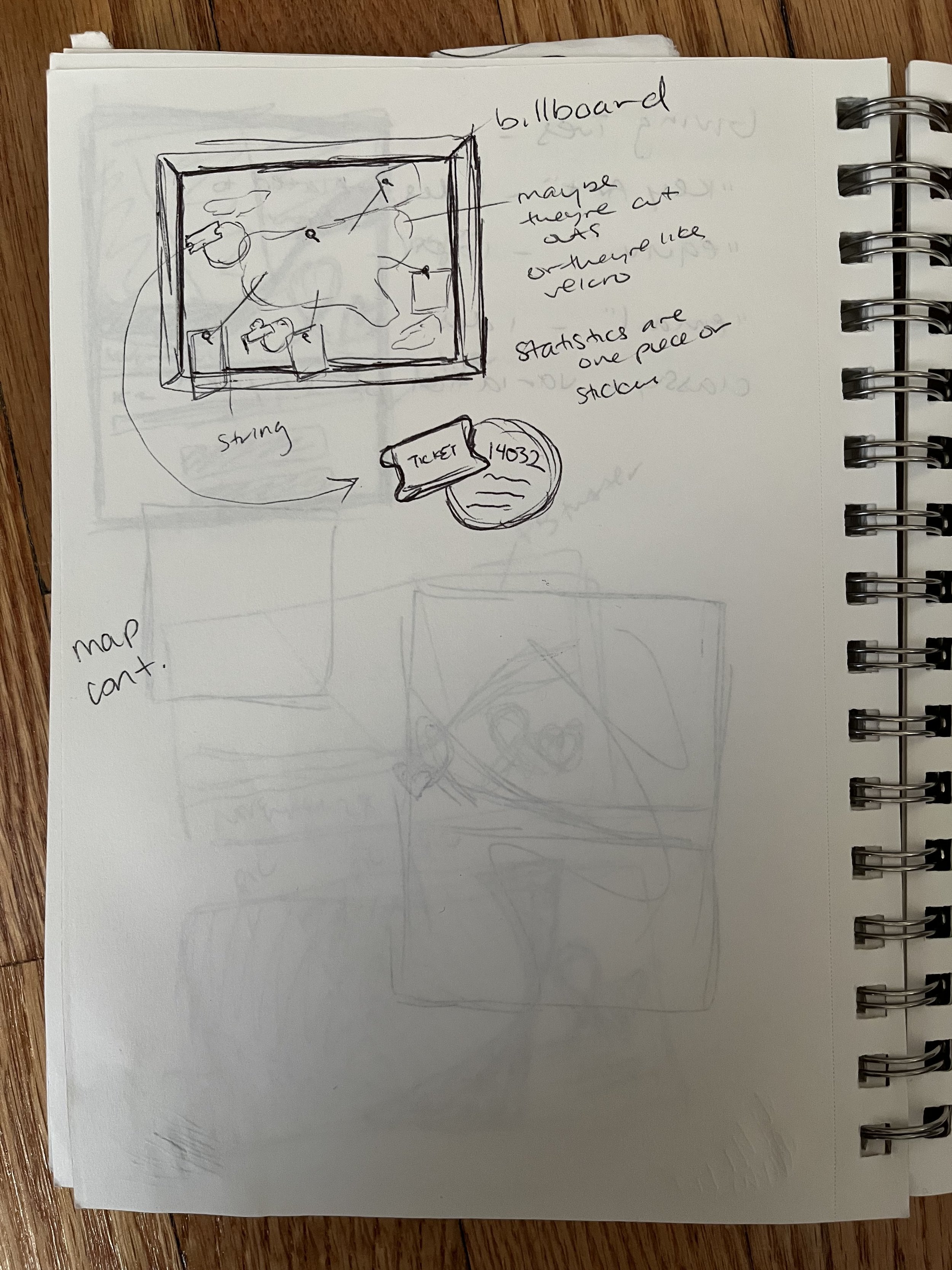
fleshing the idea out a bit more
one of the older maps I used for inspiration- I liked the pins and the ties to the stories - the lines made me visualize strings on a cork board.

Another example of the map that had pins to represent the organizations

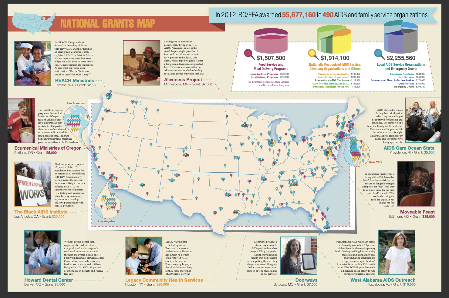
The final map

map in the magazine
my role Staff Designer; Designer of additional event collateral
more info Broadway Cares puts out a magazine twice a year, and one is larger. There’s usually a center spread of a map representing the grants distributed throughout the country. I was tasked with creating the map. I first turned to all the previous issues going back to 2012 to see how this was approached in the past. Some maps that I liked were ones that pinned the spots in the country where the grants were. That’s when I got the idea for a cork board where pins would be stuck in. Another visual that came to mind as a second option for the map was those pins being part of a scrapbook where someone clipped on notes and messages. I mocked up both and together with my design manager we settled on the map.
Now I had to create this map. How would I represent 450 organizations over 50 states? I naturally started putting in pins for every single organization, and then came up with the idea to have colors that would represent groupings. The other parts of the board came to be when thinking about that one would typically randomly place objects on a board.