
Web
Below are multiple wireframes for web that I created on XD.
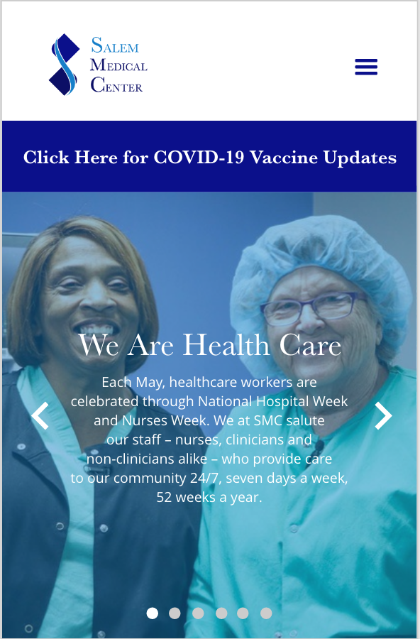
Client: Salem Medical Center
Deliverable (Slider on Homepage)
Agency: Mosaic Strategies
A slider based on a specific design referenced from another client. Was designed for mobile and web.
Read more below
-
The project manager provided me a very specific layout to follow, using another company’s slider as reference (the placement of text, image and arrows). The challenge for me was learning how to create multiple states that would function as a workable slider, which I found very exciting.
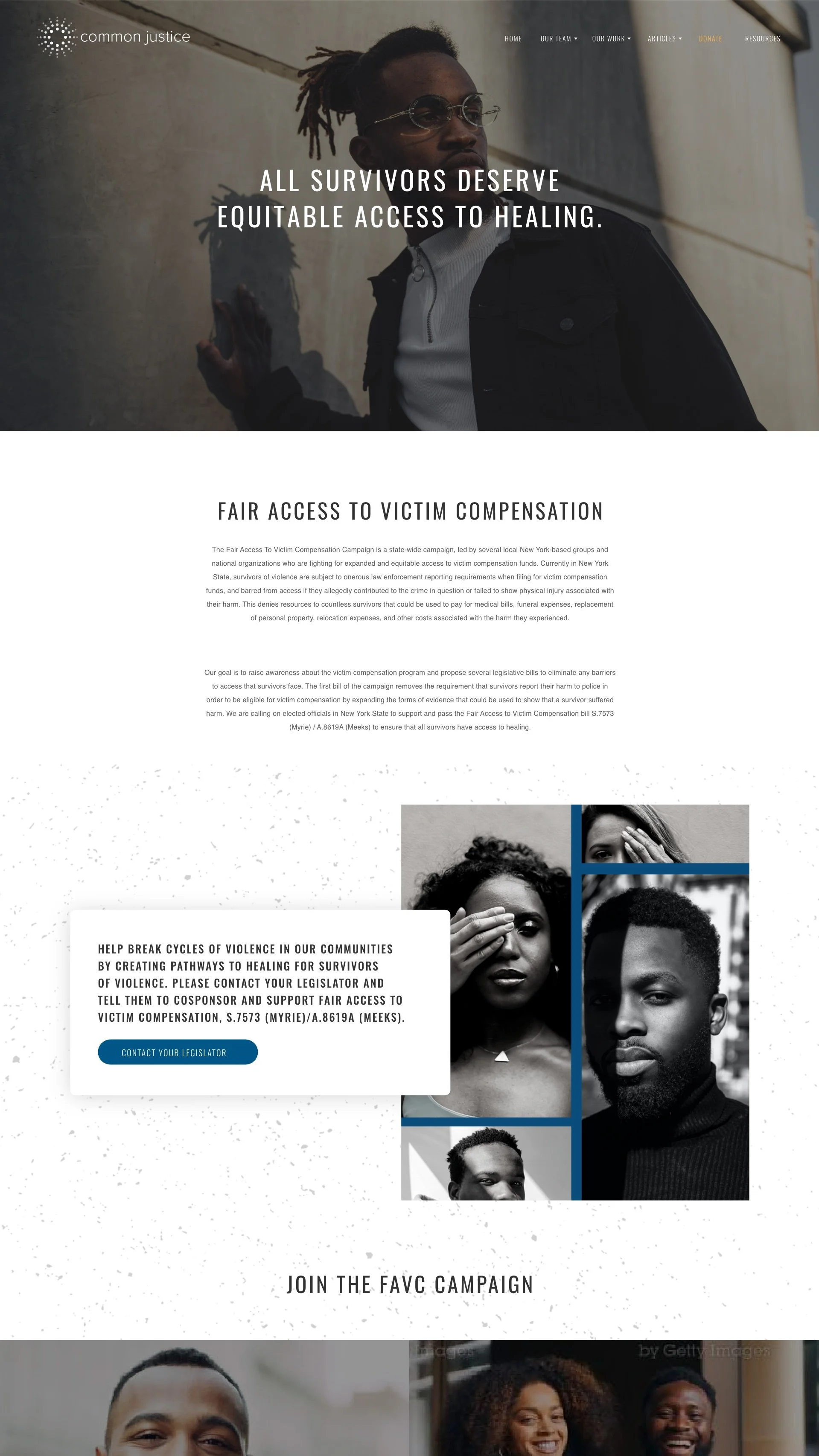
Client: Common Justice
Deliverable: Resources Section of Homepage
Agency: Mosaic Strategies
The design of the “Resources” section of the site was made by emulating the style of the homepage.
Read more below

-
I was presented with an unpublished view of the website (still in development mode) so I could create the references section. In order to create this piece, I looked for heading and body text styles so I could replicate and also make it easy to differentiate sections across the page (since the audience would just scroll down).
I had just taught myself how to create and edit components for this project and thus decided to play around with the function of the “contact your senator” and “news and press” buttons. When the person hovers over those boxes, the images zoom in and the text style changes to bold.
Client: EdPost
Deliverable: Take Action Pillar Page
Agency: Mosaic Strategies
The style of this website was very unique, having specific stylization in the text, buttons, and other elements. I approached this by researching other “take action” organizations and sites.
Read more below

-
This was a very challenging project, but it was a tremendous learning experience. The style of this website was very unique, having specific stylization in the text, buttons, and other elements. This project caused me to think outside of the box because the main page was designed in non-traditional ways.
A staff member from their company suggested splitting up the text in the header, but I thought it would disturb the flow too much. Therefore, I suggested a style (as shown) that would emulate the other main pages (podcasts, videos etc.) by incorporating the main box with copy and an image, directing you to each cause’s page.
I spent some time researching how other action pages portrayed specific topics. I also collaborated with my project manager for the “More Actions” part, the image changing to a color when hovered over it.