project
it’s art.
client
personal project
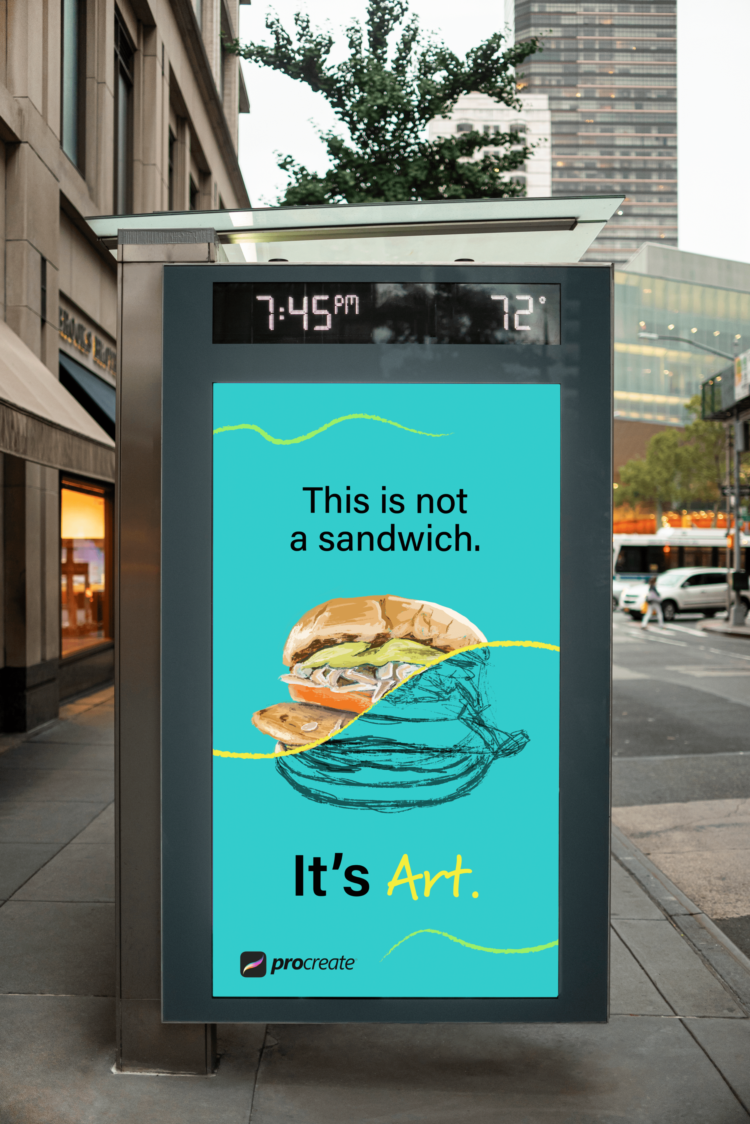
This project started as a drawing of a sandwich I did on my iPad on a program called Procreate. I wanted to find a way to integrate design and art together. I took the drawing and developed a mock campaign where Procreate partners with Feeding America.
I aimed to challenge myself in two areas: having brand consistency across the campaign and integrating my fine art into design.


concept
I originally envisioned someone driving home from work hungry, seeing this ad and thinking it was advertising a food place, but it wasn’t. Instead, it was an ad for an art app, Procreate, to show someone how convincing and realistic a drawing could be on there.
inspiration
I find myself drawn to ads that have literal language, especially ones that speak directly to you. An inspiration for me was the Oatly Milk ads, and I wanted to emulate that style. Months later I would find myself staring at ads for Pinterest in NY Penn Station, another inspiring moment.

my process
One of the challenges here was thinking about how I make it obvious that this was in fact a drawing. I had an opportunity to show it to experienced designers and in doing so I received amazing feedback that helped me reach the finish line. The “aha” moment for me was when I started playing around with lines and realized what an integral part they could play in this project. I used them to split the art in half but then realized that I could also use lines as a branding component throughout the project.

client Personal Project
my role Designer, Artist; Ideated Brand style and copy for digital deliverables and printed collateral
organization n/a
VIEW ANOTHER PROJECT


